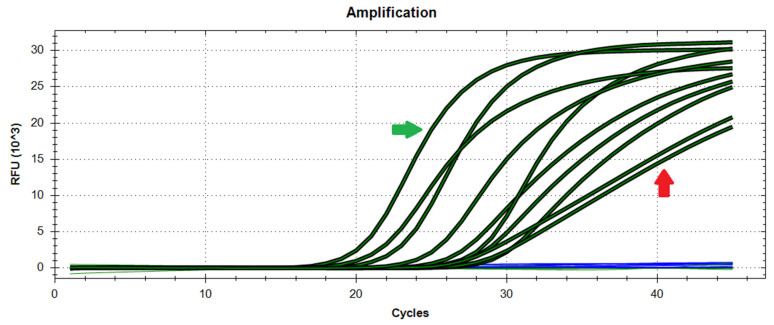
Figure 4.
Difference between genuinely positive and contaminated samples. The curves to the left of the plot are from samples that are genuinely positive (green arrow), whereas two curves to the right are perfectly linear and suggest a contamination event (red arrow). Blue lines represent samples that have not generated amplification.

