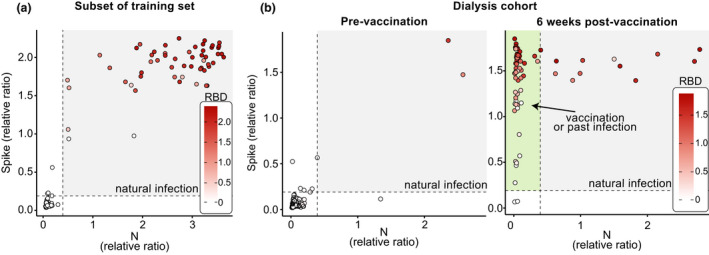
Figure 5.

Visualisation of data from three antigen testing. The results are from known negative and positive samples (a) and samples from a longitudinal study of patients on dialysis at baseline and after their first vaccine dose (b). The dashed lines represent the thresholds for spike and N. The area with positives for both spike and N (colored in gray) is indicative of natural infection and the area showing samples that are N‐negative but spike‐positive (and RBD‐positive if colored) is highlighted in green on the right panel and is indicative of vaccination.
