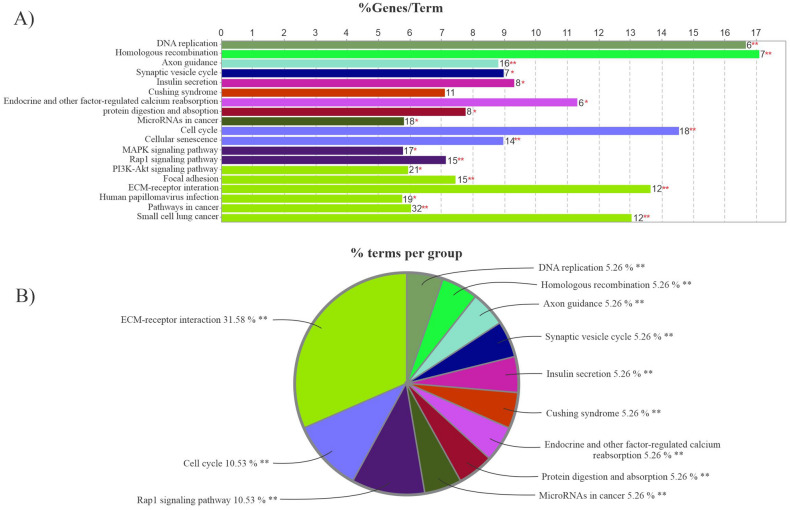
Figure 8.
KEGG pathway analysis. (A) The bars in the chart represent the number of analyzed genes associated with each term. The numbers at the top of the bars indicate the percentage of detected genes relative to all of the genes related to the term. (B) The pie chart depicts an overview of the functional groups for FImRNAs. Groups are named based on the most significant term in each group. The bar plot and pie chart were visualized using clueGO (Cytoscape plugin).

