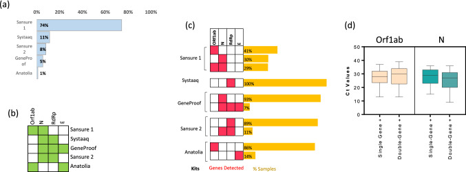
Fig. 1.
Detection frequencies of target genes and Ct values in SARS-CoV-2 positive samples. a Bar graph showing the proportion of samples analyzed by different commercial kits. b The heatmap displaying the target genes for each kit. The green-colored box indicates that this particular kit (see row labels) targets the given gene (see column labels), while the white-colored box indicates the absence of the probe for the corresponding gene. c Labels on the right side indicate the commercial kit used to analyze the SARS‐CoV‐2 suspected samples. The heatmap in the middle displays the detected genes (red, detected; white, not detected). The bar graph on the left indicates the proportion of the samples tested positive for the respective gene or combination of genes. d Box plots showing Ct values for the respective genes in single-gene positive (Orf1ab or N were detected) or double-gene positive (Orf1ab + N were detected) samples. The graphs show the distribution of Ct values, with the box indicating the 25th–75th percentiles, with the median indicated. The whiskers show the range

