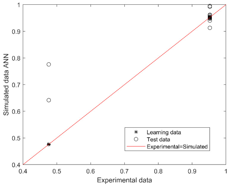
Figure 1.
Scatter plot of experimental (actual) and simulated (predicted) data for SGA or AGA. The outcome (output of the model) is SGA or AGA (codified as 0.5 or 1.0). The red line indicates the linear regression model on scatter points, and the output is the best linear fit obtained by the ANN model. The range between 0.4 and 0.79 corresponds to SGA and between 0.8 and 1.0 to AGA prediction.

