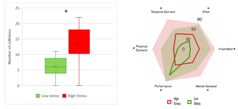
Figure 6.
Boxplot representation of the number of collisions (left) and radar chart of NASA-TLX subscales (right). In the radar chart the lines represent the median of each subscale and the shaded areas the maximum value in the population. The low-stress condition is represented in green, and high-stress in red. The asterisks show the p < 0.05 resulting from the Wilcoxon signed-rank test.

