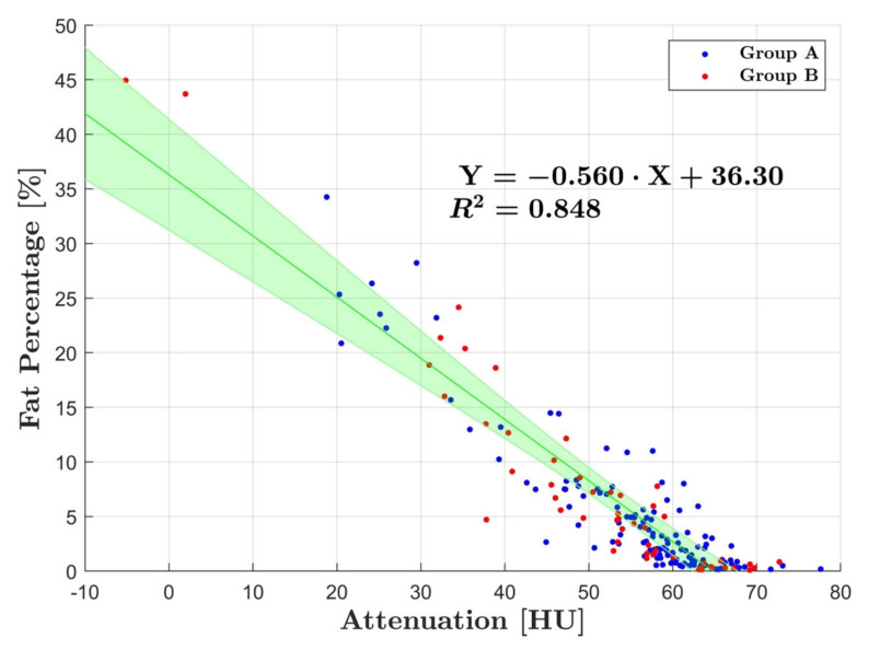
Figure 5.
Linear regression analysis with group A and B combined. There was a strong correlation between fat percentage and HU with R2 = 0.85. The blue dots represent the average measurements for group A and the red for group B. The green line corresponds to line for best fit and the shaded area represents the 95% CI.

