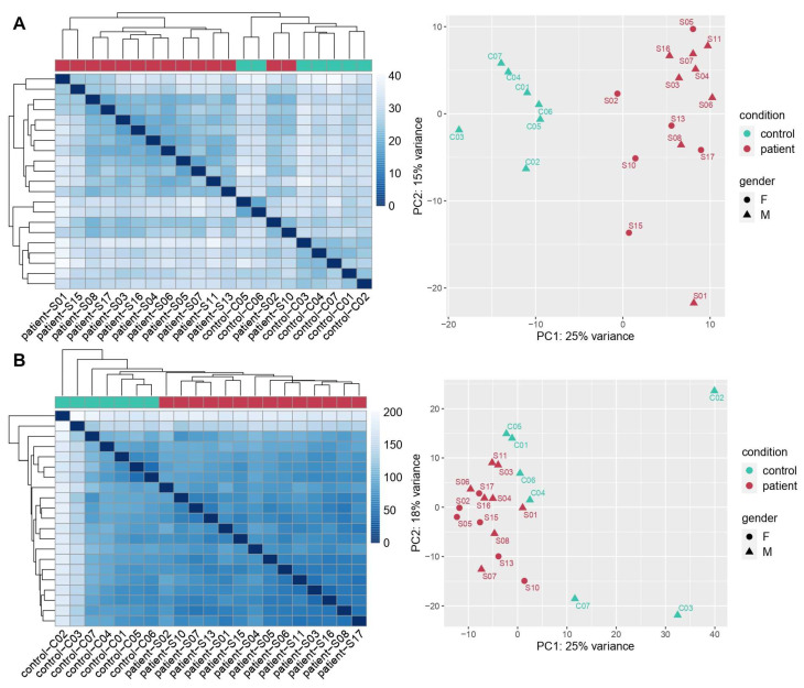
Figure 1.
Cases distribution according to distance-based hierarchical clustering heatmaps and principal component analysis (PCA) graphs related to Nanostring (A) and total RNA-Seq (B) results, respectively. The heatmaps are a color-coding graphical representation of data coming from transcriptome analyses according to differentially expressed genes (DEGs) distribution. These plots were built using the Pheatmap package in R achieved by hierarchical, agglomerative clustering methods. The PCA graph depicts variation within and between the two groups. Both representations for the two methods of analysis showed a clear separation between COVID-19 patients (samples) and controls.

