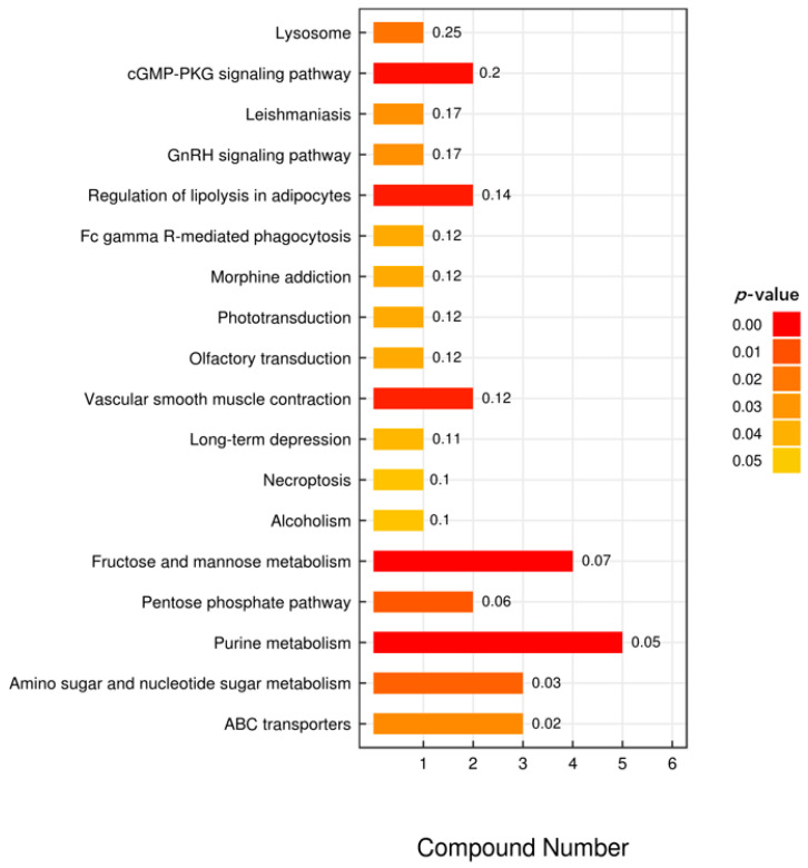
Figure 4.
KEGG analysis of intermetabolites. In the bar chart, the vertical axis represents each KEGG metabolic pathway, while the horizontal axis represents the number of differential metabolites contained in each KEGG metabolic pathway and the numbers in front of horizontal bars represent the ratio of differential metabolites to total metabolites. The color represents the p-value of the enrichment analysis. The darker the color, the smaller the p-value, and the more statistically significant.

