Figure 7.
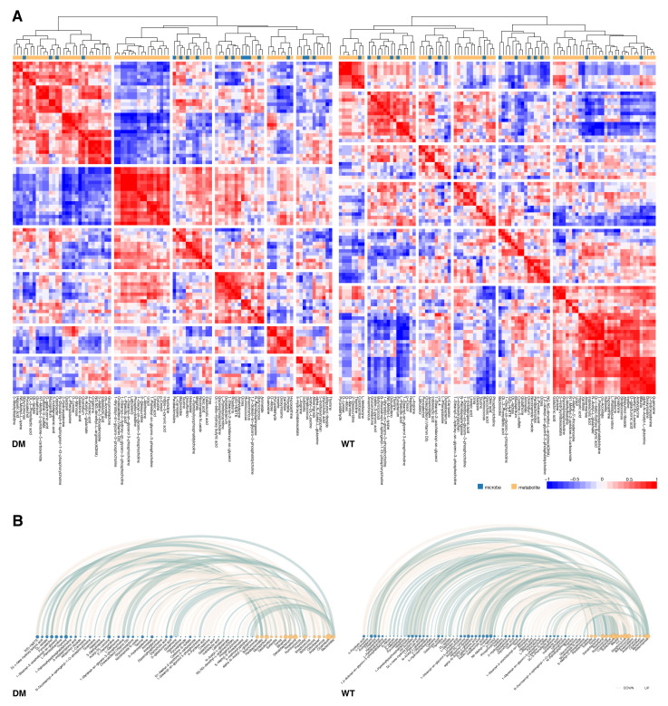
Correlation analysis of metabolites and microbes. (A) Heatmaps for correlation coefficients of metabolites and microbes in db/db and wt mice. Red represents positive correlation and blue represents negative correlation. (B) Arc diagrams for significantly correlated metabolite–microbe combinations. Light yellow edges represent significant positive correlations and light green edges represent significant negative correlations. Blue and yellow nodes represent microbes and metabolites, respectively.

