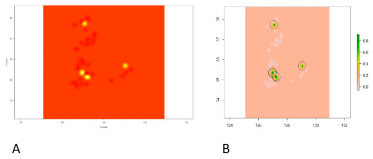
Figure 6.
Showing the intensity of the point prevalence rate on xy coordinate plane. (A) Kriged predictions of HPAI H5N8 epidemic second phase in the coordinate plane indicating longitude on X-axis and latitude on Y-axis. (B) Prediction raster with colored scale from gray to yellow and green on the right panel indicating the intensity of the point prevalence rate. The green color shows the highest predicted point prevalence rate followed by yellow, gray, and then white for the lowest point prevalence rate.

