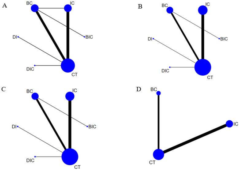
Figure 2.
Network plot of OS (A), PFS (B), ORR (C) and ≥3 TRAEs (D). Each circular node represents a treatment type. The circle size is proportional to the total number of patients. The width of the line is proportional to the number of studies performing head-to-head comparisons in the same study, and the dotted line is the indirect comparison which was shown in this network meta-analysis.

