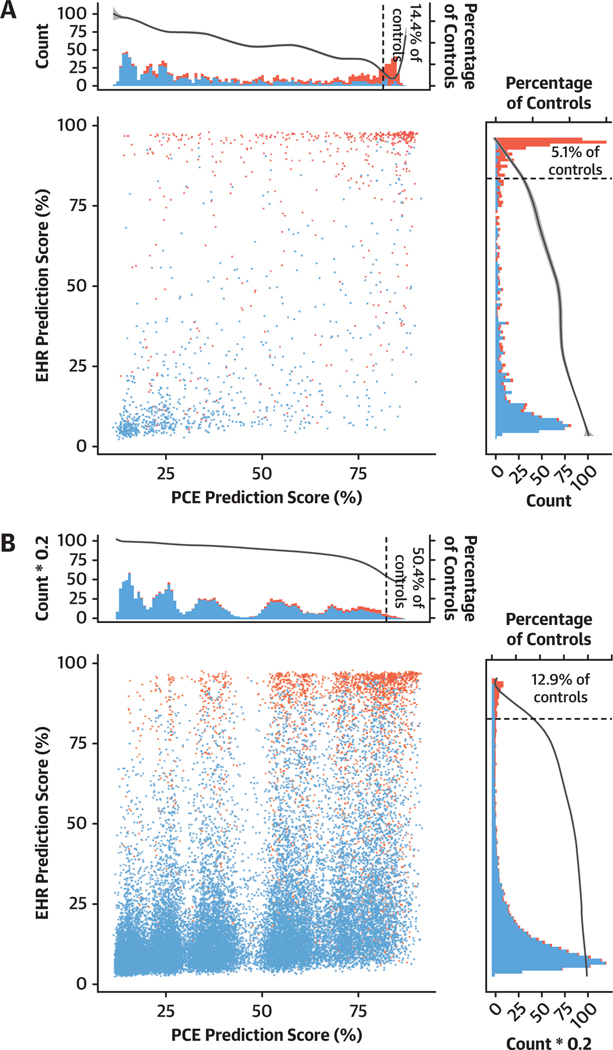
FIGURE 3.
Change in Prediction Score Between PCE model and EHR Model The models were tested in BioMe (A) and UK Biobank (B) individuals. Dot plot shows the averaged prediction of the EHR and PCE models for every tested individual in the BioMe and UK Biobank cohorts. Red and blue indicates actual cases and control subjects, respectively. Top and right histograms show the distribution of averaged PCE and EHR prediction scores, respectively. The secondary y-axes in the histograms show the percentage of control subjects predicted in a 1% wide bin of the prediction score. Dotted vertical line indicates the 85% threshold. Abbreviations as in Figure 2.

