Fig. 4.
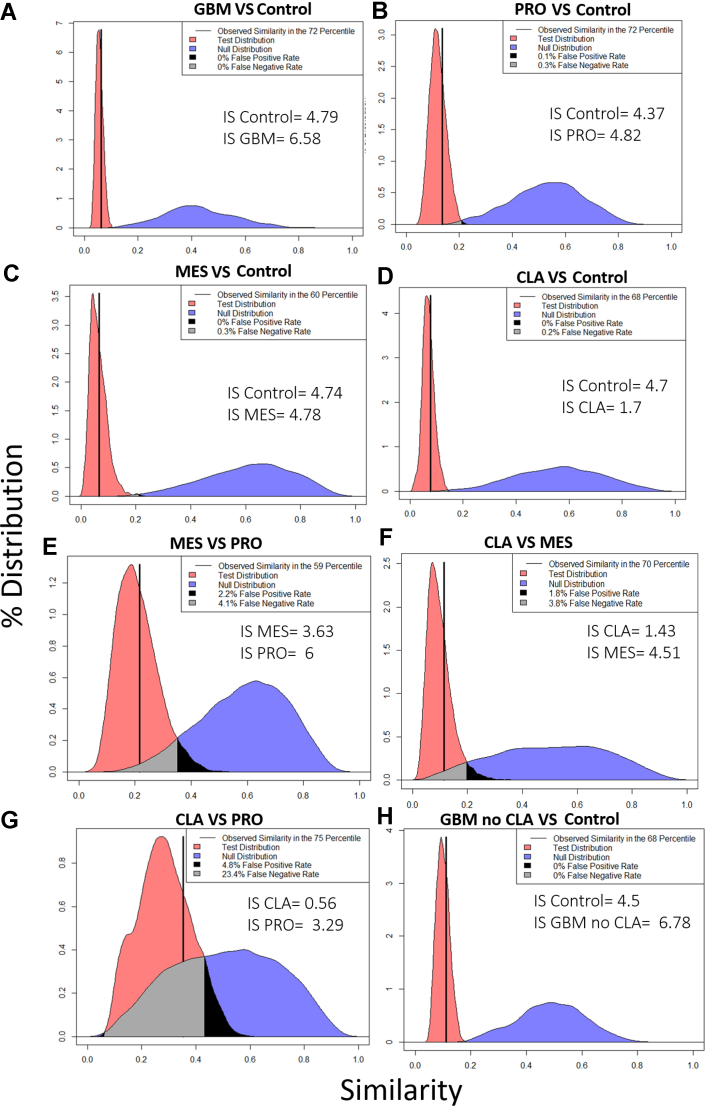
Similarity plots using RAMZIS. The modified Tanimoto similarity metric is represented on the x-axis, and the y-axis represents the percent of similarity distribution present at a given similarity. The observed similarity is represented by the solid vertical black line. As a metric of simulation functionality and reasonability, the observed similarity is placed within the test distribution as a percentile; an observed similarity within two standard deviations of the mean and within the two center quartiles passes the quality metrics. The test and null distributions are represented in red and blue colors, respectively. The gray shaded region within the comparisons represent the overlap of the two distributions that can be perceived as a false negative observation, wherein it is possible to observe a nontest similarity comparison but more likely for it to be a test similarity comparison; the black shaded region is considered false positives with a test observation possible, but a nontest observation being more likely. We accept up to a 20% false negative rate and a 5% false positive rate in line with other statistical standards. The observed similarity should be within the central quartiles (25%–75%) if RAMZIS has correctly simulated the data. Internal Similarity Confidence scores (IS) should be greater than 2, indicating a less than 3% chance that the internal and test similarity means could be conflated. Ideal similarity distributions are tightly defined with minimal tails; broader distributions indicate less reproducible similarity comparisons. A, GBM versus control. B, PRO versus control. C, MES versus control. D, CLA versus control; E, MES versus PRO. F, CLA versus MES. G, CLA versus PRO. H, GBM no CLA versus control. CLA, classical; GBM, glioblastoma; MES, mesenchymal; PRO, proneural.

