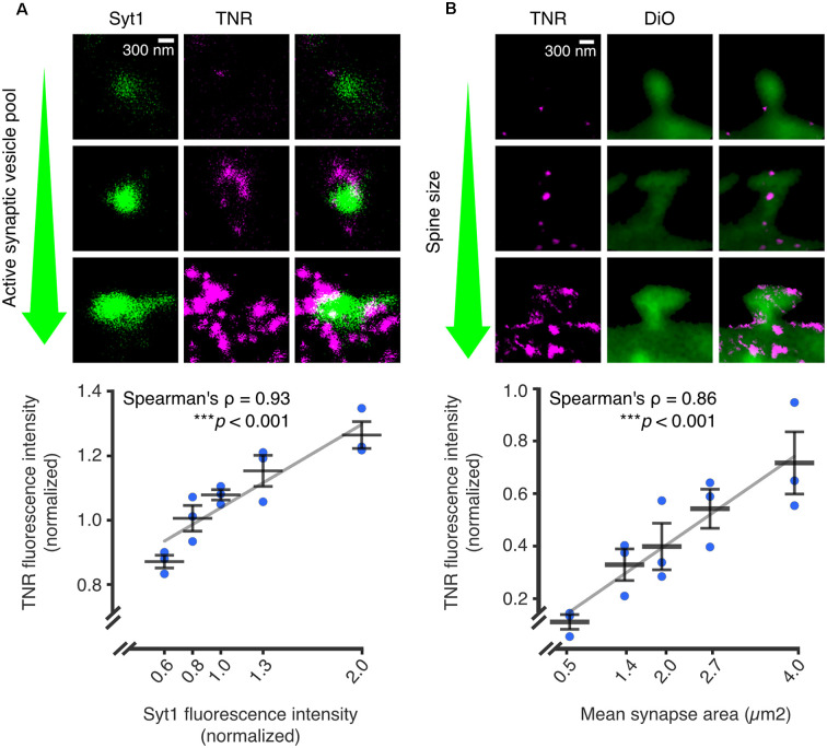
Figure 4.
The abundance of recycling TNR molecules at synapses is correlated to synaptic weight. Recycling TNR epitopes were labeled using a live immunostaining-based assay. First, all surface-bound epitopes are blocked with unlabeled antibodies against TNR. After a period of time, newly-emerged epitopes are revealed with the same TNR antibodies conjugated to fluorophores. (A) Newly-emerged TNR epitopes were labeled 12 h after surface-blocking (magenta). At the same time, actively recycling synaptic vesicles were labeled with antibodies against the lumenal domain of synaptotagmin1 (Syt1; green), as a proxy for synaptic activity. Shown are three exemplary synapses with increasingly larger active vesicle pools, imaged in confocal (Syt1) and STED (TNR). The mean fluorescence intensities of TNR and Syt1, normalized to the medians of each respective experiment, are plotted against each other. The values for Syt1 were divided into five bins containing equal numbers of synapses. Quantification of the correlation between the intensities demonstrates a strong link between the size of the active vesicle pool and the amount of recycling TNR epitopes (N = 3 independent experiments, >1,100 synapses imaged per datapoint, Spearman’s ρ = 0.927, ***p < 0.001). (B) Newly-emerged TNRs were labeled in a similar fashion to panel a (magenta), and the neuronal membranes were visualized by incubation with the lipophilic dye DiO (green). Shown are exemplary images of postsynapses with increasingly larger head sizes. The mean fluorescence intensities of TNR and the mean synapse area, normalized to the medians of each respective experiment, are plotted against each other. The values for the synapse area were divided into five bins containing equal numbers of synapses. Quantification of the correlation between the intensities demonstrates a strong link between the size of the dendritic spine and the amount of recycling TNR epitopes (N = independent experiments, >280 synapses imaged per datapoint, Spearman’s ρ = 0.862, ***p < 0.001. Scale bars = 300 nm. The data shown in the plots represent the means (long horizontal lines) ± SEM (short horizontal lines), with individual dots indicating separate experiments. Adapted from Dankovich et al. (2021) with permission from Springer Nature (http://creativecommons.org/licenses/by/4.0/).

