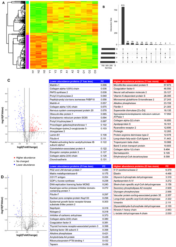
Figure 8.
Proteomics analysis. (A) The heatmap of the four age groups, with three biological replicates for each group. The proteins selected were based on a false discovery rate (FDR) < 0.05 and an absolute average log2 ratio > 1. (B) The UpSet plot of all the proteins identified for the four age groups. (C) The volcano plot of proteins in the young and newborn groups. The blue dots represent the lower abundance proteins in the young group compared to the newborn group. The red dots represent the higher abundance proteins in the young group compared to the newborn group. The gray dots show the proteins with no difference between the two groups. The top 20 lower and higher abundance proteins are listed (FC: fold change). (D) The volcano plot of proteins in the old and adult groups. The blue dots represent the lower abundance proteins in the old group compared to the adult group. The red dots represent the higher abundance proteins in the old group compared to the adult group. The gray dots show the proteins with no difference between the two groups. The top 20 lower abundance and top 20 higher abundance proteins are listed (FC: fold change).

