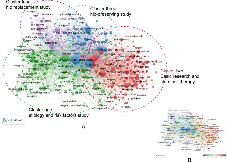
Fig. 8.
A Network visualization map of the co-occurrence network of keywords using VOSviewer. Each node represents a certain keyword. Nodes and font size represent the number of keyword occurrences. Keywords with close correlation will be assigned to one cluster with the same color. B Overlay visualization map of keywords analysis in the ONFH field. The color of each node shows the average appearing year (AAY) of the keyword, according to the color gradient shown at the bottom right. The blue-purple color reflected the keywords appeared relatively earlier, while the dark red nodes represented the recent occurrence

