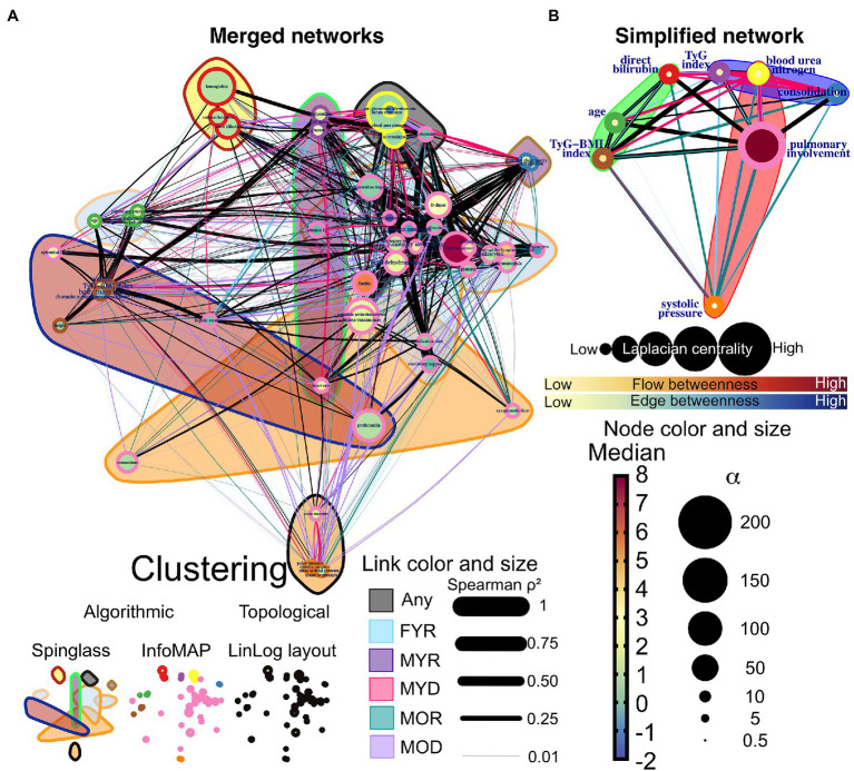
Figure 10.
Network differences. (A) The networks of the five study groups were merged to determine which edges differed between them. Links that are unique to a study group are highlighted in color, while shared links are black. Each correlation’s strength is indicated by the width of the links. LinLog layout was used to arrange the nodes. The color of the node represents the normalized median value for the whole database, and the size represents the deviation from the normal distribution. The color-shaded areas in this network represent spinglass clusters, while the node border represents the nodes that will be collapsed into a single supernode by InfoMAP clustering. (B) Depicts a simplified network in which supernodes are labeled with the name of the physiological variable with the greatest influence within the InfoMAP community. Edges were kept, resulting in a network with multiple edges. The flow betweenness centrality is represented by node color, and the laplacian centrality is represented by node size.

