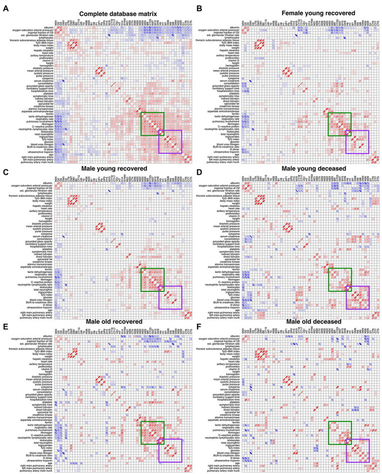
Figure 5.
Unfiltered Spearman correlation matrices. (A) displays the filtered correlation matrix resulting from the analysis of the entire database. The Spearman correlation matrix for each study group is shown (B–F). Positive correlations are represented by red ellipses, while negative correlations are represented by blue ellipses. The rows and columns are arranged by optimal leaf order. Green square shows a region of correlations present in the networks from recovered groups and the purple square shows a region of correlations present in the deceased groups.

