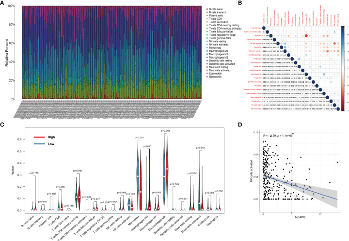
Figure 6.
The landscape of immune infiltration in glioma cells. (A) The proportions of immune cells in each glioma sample are indicated with different colors, and the lengths of the bars in the bar chart indicate the levels of the immune cell populations. (B) Correlation matrix for all 22 immune cell proportions. Some immune cells were negatively related, represented in blue, while others were positively related, represented in red. The darker the color, the higher the correlation (P < 0.05). (C) Violin plot visualizing the differentially infiltrated immune cells. (D) the relation between the expression of NCAPG and NK cell activation.

