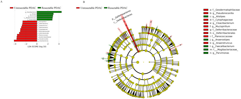
Figure 5.
LEfSE Plot. A, LDA score. The histogram of LDA value distribution shows the species with significant differences in abundance between groups, and the length of the histogram represents the impact of different species. The red column represents unresectable PDAC patients, and green represents resectable PDAC patients; B, Evolutionary branch map. The circle radiating from the inside to outside represents the classification level from phylum to genus (or species). Each small circle at different classification levels represents a classification at that level, and the diameter of the small circle is proportional to the relative abundance. Species without significant differences are uniformly coloured yellow. The red node represents the microbial group that plays an important role in the red group, and the green node represents the microbial group that plays an important role in the green group.

