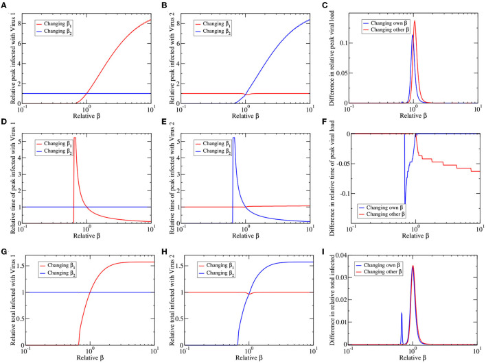
Figure 4.
Co-circulating viruses with different infection rates. We change the infection rate of virus 1 (red lines) or virus 2 (blue lines), leaving other parameters the same, and plot the peak number of infected (A–C), time of epidemic peak (D–F), and total number of infected (G–I) for virus 1 (A,D,G) and virus 2 (B,E,H). All values are presented as relative to their values for a single virus epidemic. (C,F,I) The graphs highlight asymmetries in response of the two viruses by subtracting blue lines from corresponding red lines in the left and center columns.

