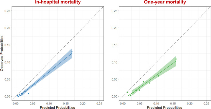
Figure 2.
Calibration plot of the Global Registry of Acute Coronary Events risk score for in-hospital mortality (blue) and 1-year mortality (green) in the validation cohort. Patients were divided into deciles based on the predicted risk of mortality, each data point represents one decile. The dashed line shows absolute agreement between the observed and predicted rates.

