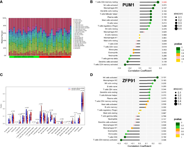
Figure 8.
Immune infiltration analysis of shared biomarkers in PsA. (A) The barplot of immune cell infiltration. (B) Correlation between PUM1 and infiltrating immune cells. (C) Violin diagram of the proportion of 22 types of immune cells. The red marks represent the difference in infiltration between the two groups of samples. (D) Correlation between ZFP91 and infiltrating immune cells.

