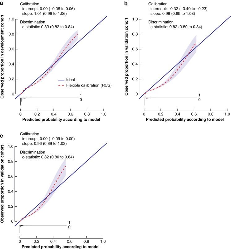
Fig. 2.
a Flexible calibration curve of the original model. Calibration plot for predicted 30-day mortality in the development cohort (51 484 patients). The calibration slope depicts the strength of predictors. The calibration intercept reflects the calibration in the large, indicating whether predicted probabilities are systematically under- or overestimated. The flexible calibration curve allows examination of calibration across a range of predicted values. A curve close to the diagonal line (i.e. perfect calibration) indicates that predicted (x-axis) and observed probabilities (y-axis) correspond well. The linear bar chart shows the distribution of patients with (= 1) or without (= 0) an observed outcome. Discrimination between a low and high likelihood of 30-day mortality was good (C statistic 0.83, 95 per cent confidence interval (c.i.) 0.82 to 0.84). b Flexible calibration curve of the validation model. Calibration plot for predicted 30-day mortality in the development cohort (32 926 patients). Discrimination between low and high likelihood of 30-day mortality was good (C statistic 0.82, 95 per cent c.i. 0.80 to 0.84). The flexible calibration curve shows some overestimation of predicted risks across the range of true risks. c Flexible calibration curve of the intercept-adjusted model. Calibration plot for predicted 30-day mortality in the development cohort (32 926 patients). Discrimination between a low and high likelihood of 30-day mortality was good (C statistic 0.82, 95 per cent c.i. 0.80 to 0.84). The flexible calibration curve shows some overestimation of predicted probabilities across the between 5 and 30 per cent range of true risks and some underestimation of predicted probabilities across the range of true risks above 30 per cent. RCS, restricted cubic spline.

