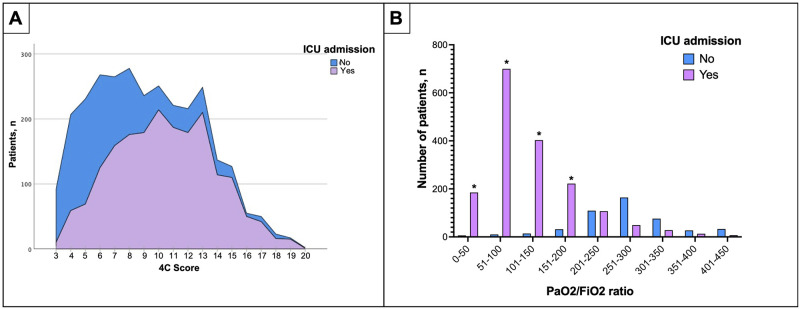
Fig 2.
(A) Correlation between the 4C score and the ICU admission rate. This figure compares the number of patients admitted to the ICU (Y-axis) and their punctuation in the 4C score (X-axis). In purple, the patients were admitted to the ICU, and in blue, patients were not admitted. The ICU admission rate increases as the 4C score do. In contrast, most patients rated with 4C scores of 6 or less were more frequently treated outside the ICU. (B) Comparison between PaO2/FiO2 ratio and the number of patients admitted to ICU. This figure compares the number of patients admitted to ICU in purple columns the number of patients who were not admitted to the ICU in blue columns. Patients with a low PaO2/FiO2 ratio were the most admitted to ICU.

