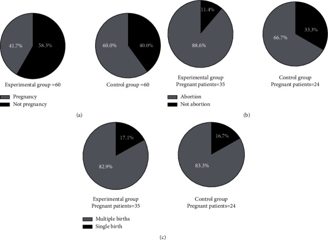
Figure 2.

Comparison of pregnancy outcomes (n (%)). (∗Note: in Figures (a, b, c), the experimental group was on the left, and the control group was on the right. # indicated P < 0.001. (a) Clinical pregnancy rate. The black area was pregnancy, and the gray area was not pregnancy. Compared with the control group, clinical pregnancy rate of the experimental group was obviously higher (35 vs 24, P < 0.05). (b) Abortion rate. The black area was abortion, and the gray area was not abortion. Compared with the control group, abortion rate of the experimental group was obviously lower (4 vs 8, P < 0.05). (c) Multiple births rate. The black area was multiple births, and the gray area was single birth, with no significant difference in multiple births rate (6 vs 4, P > 0.05)).
