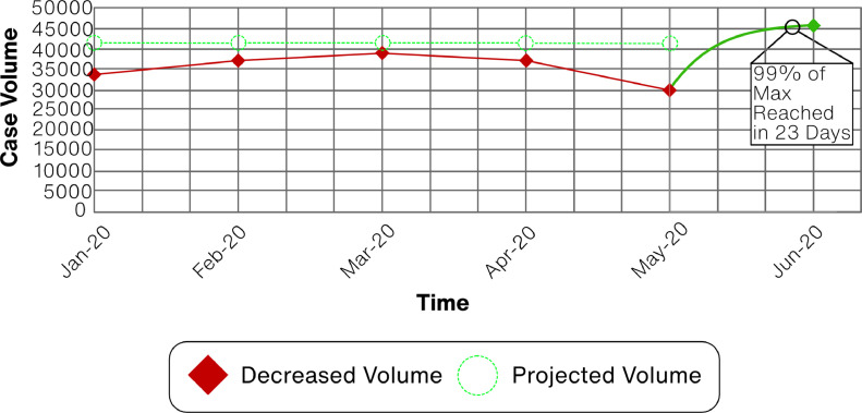
Figure 3.
Case Volume Plot. Case volume is plotted from January to June 2020. Decreased volume (red diamonds) and expected (green circles) are shown for each month. The expected values are projections from the NIS data and the decreased volume is the institutional experience applied to the projected case values. The Gompertz recovery function (solid green) was modeled between the May and June data points. (Color version of figure is available online at http://www.semthorcardiovascsurg.com.)

