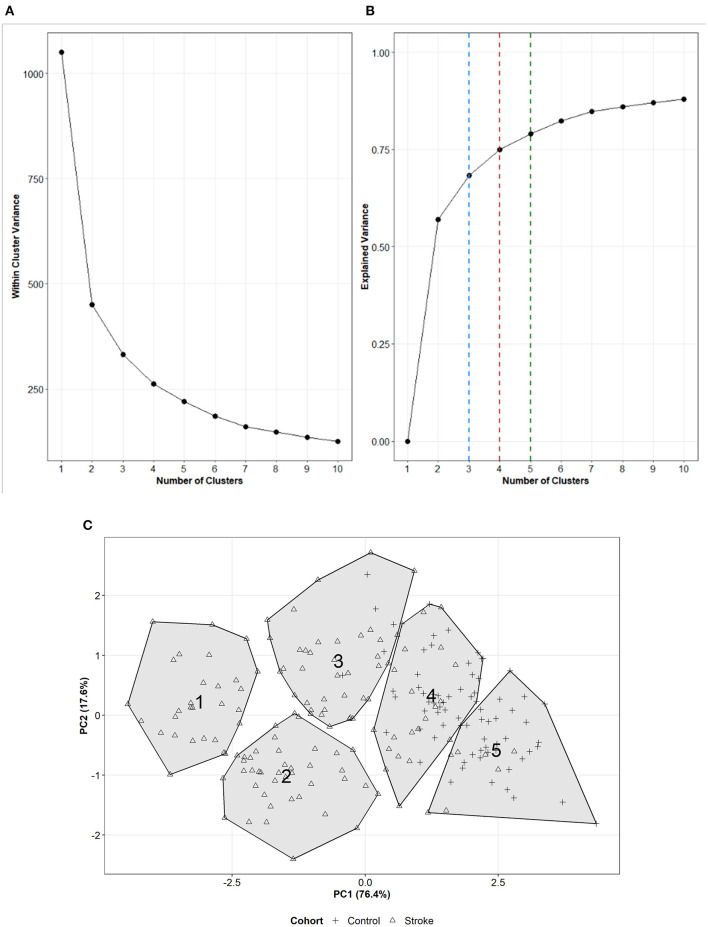
Figure 1.
(A) Scree plot representing how the within-cluster variance changes as increasing numbers of clusters are formed with 5 UL performance variables. (B) Line plot representing how the total explained variance changes with increasing numbers of clusters on dataset including 5 UL performance variables. The dashed lines represent the total variance explained for a 3- (blue), 4- (red), or 5- (green) cluster solution. (C) Visual representation of the 5-clusters with 5 UL performance variables across dimension 1 (x-axis) and dimension 2 (y-axis). The cluster number is presented in the location of the centroid of each cluster. The shape of the point within the cluster represents the if a participant was from a stroke (triangle) or control (+ sign) cohort.

