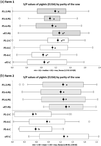
FIGURE 3.

Distribution of S/P ratios by parity of the sow in Farm 1 (batches 1–4 and 6) and Farm 2 (batches 1 and 2). The whiskers and boxes depict, from left to right: minimum, lower quartile, median (diamond), upper quartile and maximum. The Y‐axis indicate the parity of the sows in PG and C groups. Statistically significant differences (p < 0.05) are shown by different letters between groups within each farm. Asterisks indicate a p‐value between 0.1 (*) and 0.05 (**)
