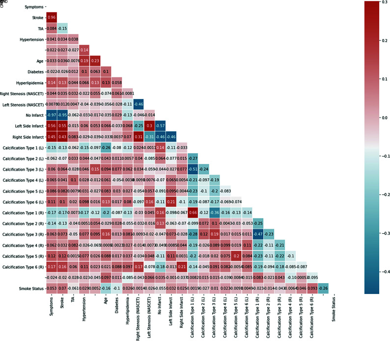
FIG 4.
The Pearson ρ correlogram shows the correlation test among the different demographic variables and the calcification types. Each box represents a correlation test, the blue values represent negative correlations, and the red values represent positive associations. CAD indicates coronary artery disease; L, left; R, right.

