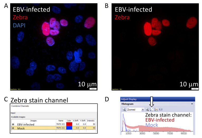
Figure 7. Generating an overlaid histogram with CellSens Dimension Software to illustrate signal to noise.
The cropped images illustrate steps 2–5 described in Part IV: Image Data Analysis (A). This example compares the signal of a Zebra-stained image, from a nasopharyngeal pseudo-ALI culture (donor NPH10A) infected with EBV harvested at 5 days p.i., with a mock-infected control ( Ziegler et al., 2021 ). A. Maximum intensity projection of a Zebra-stained z-stack image (red) with DAPI (blue) in the EBV-infected sample. B. The red channel displaying the signal of the Zebra stain is separated for further analysis. C. The two red channel images corresponding to the Zebra stain in the EBV-infected and mock control are selected, and the color for the mock image is pseudocolored blue. D. The final overlaid histogram for the Zebra-stained channel is shown. Red denotes the EBV-infected sample and blue denotes the mock-infected sample. The arrow indicates the button to toggle between the logarithmic and linear display scale, whichever best shows the signal-to-noise ratio between the EBV-infected vs mock sample.

