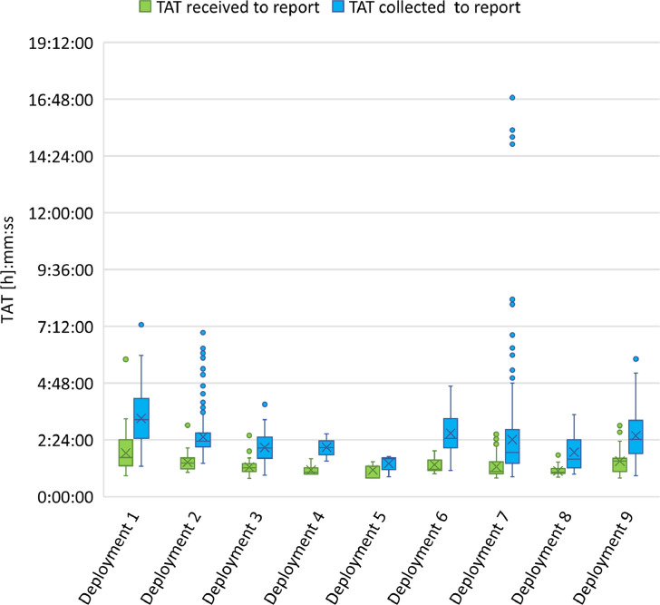
Figure 4.
Box plot of the comparison of TAT for sample processing at LabVan deployments. Boxes extend from the 25th to the 75th percentile, and within each box, horizontal lines denote the median and the cross (X) denotes the mean. The whiskers mark the upper and lower bounds that are 1.5 times the interquartile range (IQR); values beyond these upper and lower bounds were considered outliers and are marked with coloured dots.

