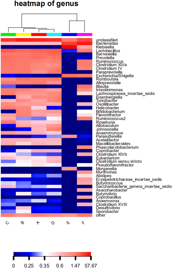
FIGURE 3.
The level of abundance of the top 50 genera in each group of samples. The samples were first clustered according to their similarity, and subsequently arranged laterally according to the clustering results. Similarly, taxa are also clustered according to the distribution similarity of each taxon in different samples, and arranged vertically according to the clustering results. In the figure, red represents the genus with a higher abundance in the corresponding sample, and blue represents the genus with a lower abundance.

