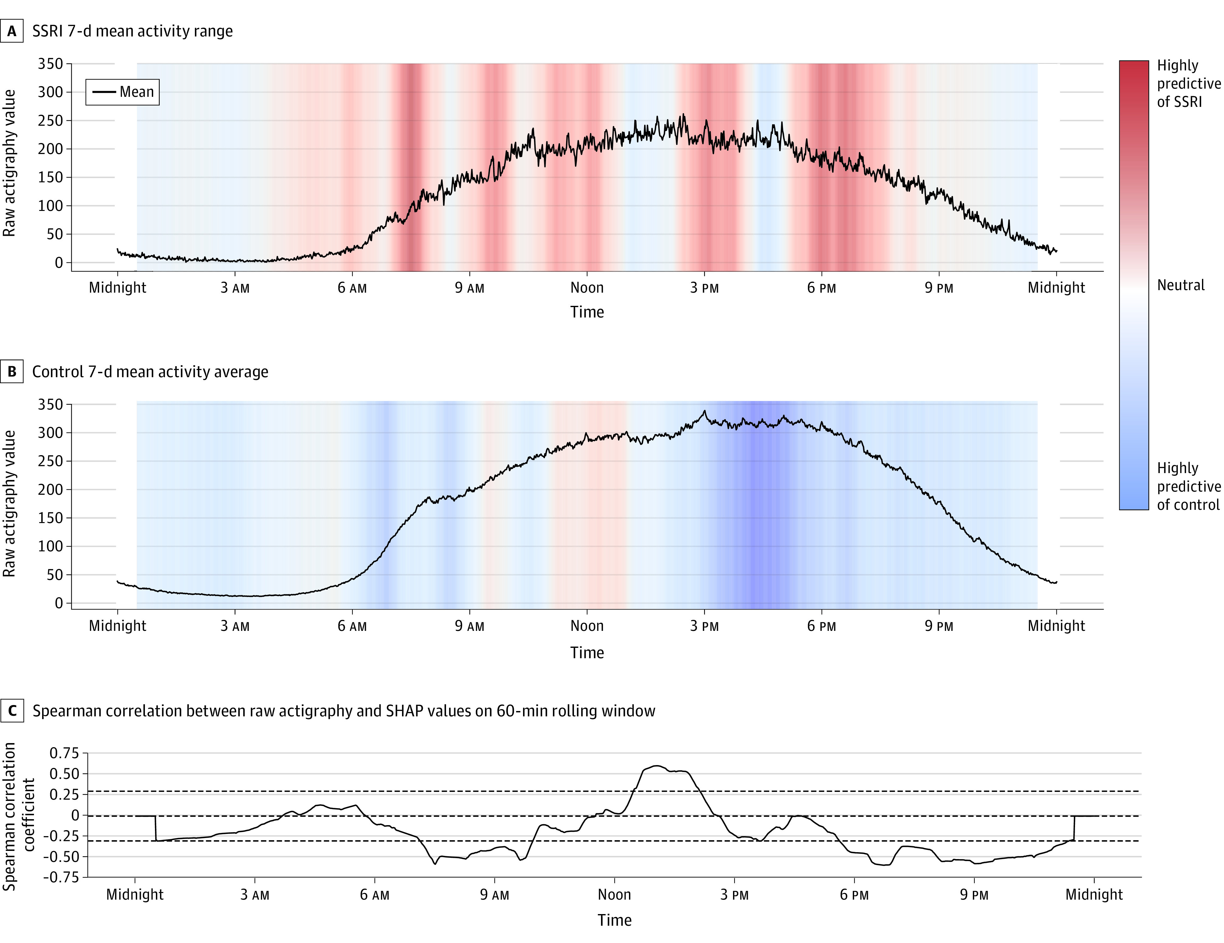
Figure 3. Shapley Additive Explanations (SHAP) Values for Actigraphy Modeling.

A, Activity magnitude for participants in the selective serotonin reuptake inhibitor (SSRI) group over time. B, Activity for control participants. The curves (A and B) indicate the mean movement across the respective groups across weeks. These curves were plotted against colored SHAP values, where red regions correspond to high SHAP values and blue regions correspond to low SHAP values. High or red SHAP values suggest a positive association between movement and SSRI use, and low or blue SHAP values suggest a negative association between movement and SSRI use. Regions of relatively high or low SHAP values reveal time frames that were influential to the model’s prediction. C, Spearman correlation between participants’ raw actigraphy values and corresponding SHAP values for every minute in a day, smoothed with a 60-minute rolling window mean value.
