
FIGURE 4.
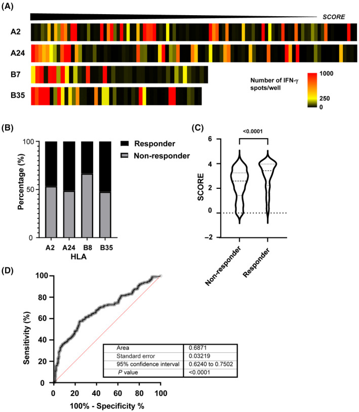
Pipeline prediction power. (A) Heat map showing each human leukocyte antigen (HLA) used in SCORE function. The highest values are shown on the left side. The color pattern shows the average number of spots per peptide. (B) Percentage of immunogenic peptides (responders) in total peptide for each HLA‐Tgm. (C) Score comparison between responders and non‐responders. (D) Area under the receiver operating characteristic (AUC ROC) curve = 0.6871, P < 0.0001