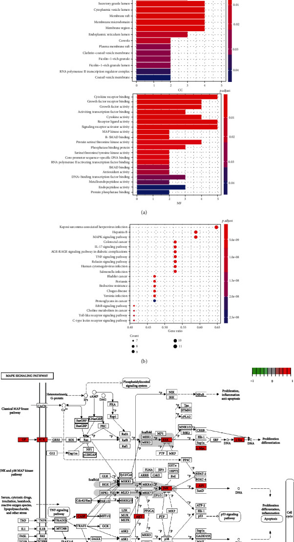
Figure 3.

(a) The BP, CC, and MF column color symbolizes the enrichment significance based on the corrected P value. The horizontal axis represents the number of genes enriched on each item. (b) The vertical axis of the KEGG bubble diagram represents the enrichment degree according to the corrected P value. Moreover, the horizontal axis shows the gene proportion enriched in each entry. (c) MAPK signaling pathway. The relevant targets of the MAPK signaling pathway are marked red.
