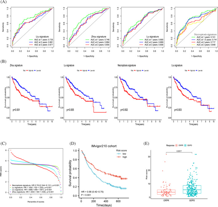
FIGURE 10.

Comparison and analysis between models. (A‐C) Comparison of the three authors with our model, ROC curve and KM curve demonstrates the predictive power metrics of different models. (D) Survival curve analysis of the immunotherapy cohort. (E) Variability between risk scores among different response groups
