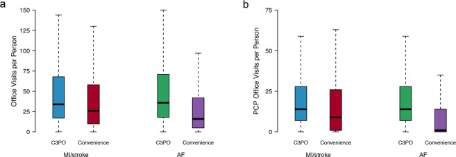
Fig. 2. Distribution of office visits in C3PO versus Convenience Samples.
Depicted are boxplots demonstrating the distribution of office visits (a) and primary care physician (PCP) office visits (b) in the C3PO analysis samples (AF [blue] and MI/stroke [green]) versus the respective Convenience Samples (AF [red] and MI/stroke [purple]). In each boxplot, the black bar denotes the median number of office visits per individual, the box represents the interquartile range, and the whiskers represent points beyond the interquartile range. Points greater than quartile 3 plus 1.5 times the interquartile range and points smaller than quartile 1 minus 1.5 times the interquartile range are not depicted.

