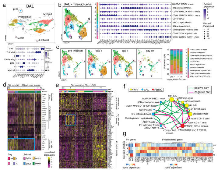
Fig. 3. Myeloid cell activation in the airways after SARS-CoV-2 infection.
(A) UMAP plot of scRNAseq data from BAL of 4 rhesus macaques (DGCX, DG3V, DHGF, and DHKM) (top panel). Cell clusters are annotated based on broad cell-types and are circled and indicated on the plot. Each dot represents a cell and is colored by cluster. Dot plot displays expression level of markers used to identify the cell types (lower panel). Color intensity and dot size represent level of expression and percent of cells in that cluster expressing the gene marker as defined in the key. (B) UMAP plot (left) of the sub-clustering of the myeloid cells from A. Clusters were annotated with cell-types based on gene expression patterns as shown on the dot plot and are identified with different numbers and colors on the plots. (right). (C) UMAP plots depict the kinetic of myeloid cells over time (left) and the fraction of cells that compromise each cluster at pre-infection, and day 4, 7, and 10 post-infection is summarized as the bar plot (right). (D-E) Normalized gene expression from cells of two BAL myeloid clusters is visualized as a hierarchically clustered heatmap. The timepoints and animals are indicated as colored bars above the heatmap and are defined in the color key. Only genes that were differentially expressed between timepoints (log fold change ≥ 0.5 and adjusted p-value < 0.01) are shown. Biological processes associated with the genes are indicated on the side and the blue box highlights type I IFN-responsive genes up-regulated at day 4. (F) Spearman’s correlation matrix based on the kinetics of viral loads and fraction of cells from BAL and PBMC myeloid and lymphoid clusters was calculated and visualized as a correlation network. Each circle represents a parameter with the different colors indicating a viral, BAL or PBMC cluster parameter. The size of the circle is proportional to the number of significant correlations (adjusted p < 0.05). A connecting line between two parameters indicates a significant correlation with green and pink lines signifying a positive and negative correlation respectively. (G) Average expression of IFN and IFN-stimulated genes from all BAL cells separated by time is clustered and represented as a heatmap. Genes that show a significant difference (adjusted p < 0.05) in expression over time are indicated with *.

