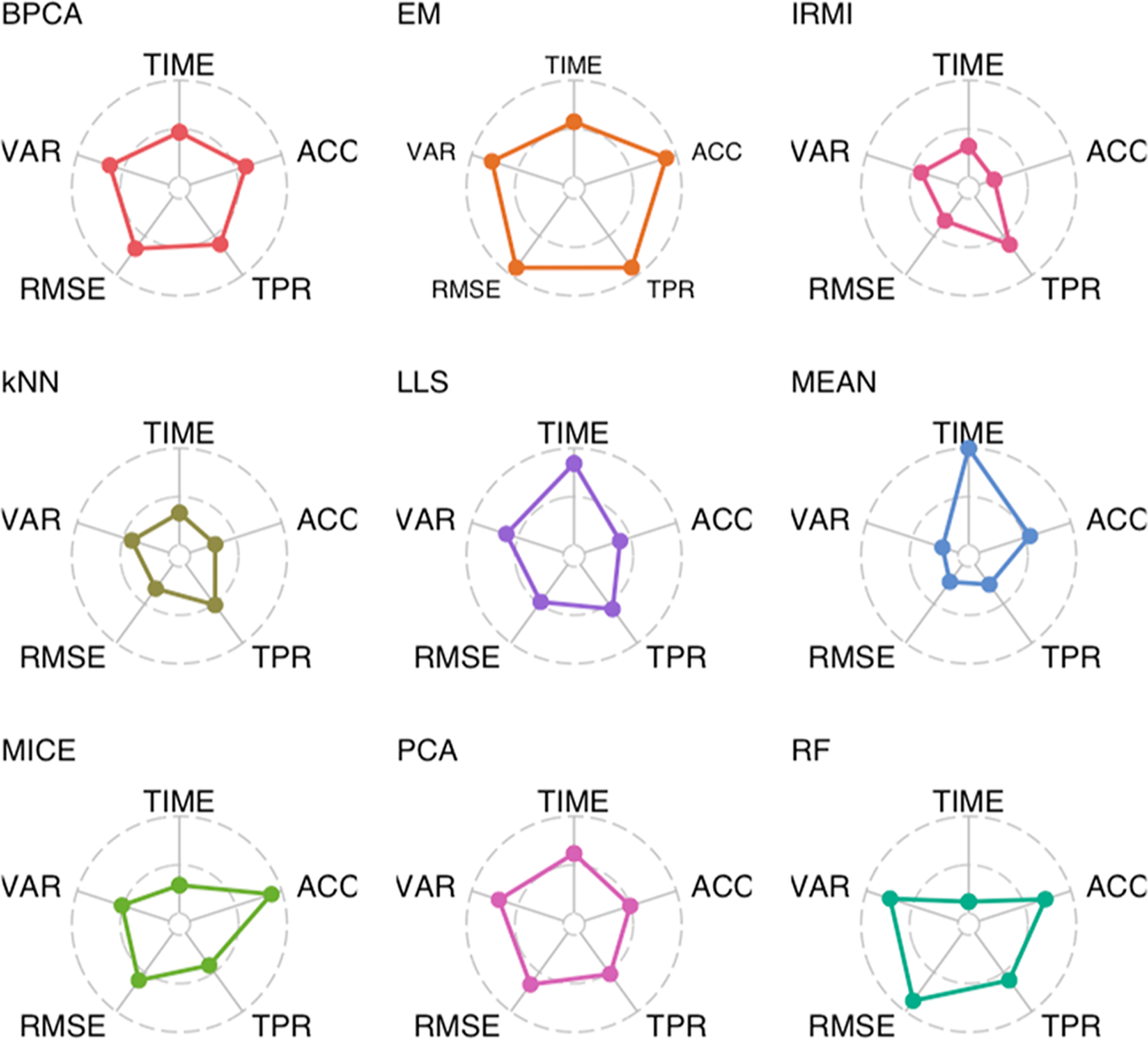
Figure 6.

Radar plots giving the mean rank of each imputation method, across all levels of the number of plexes and percentage of missing data, for five performance metrics. Values on the outer circle and inner circle correspond to the best and worst performing imputation methods, respectively.
