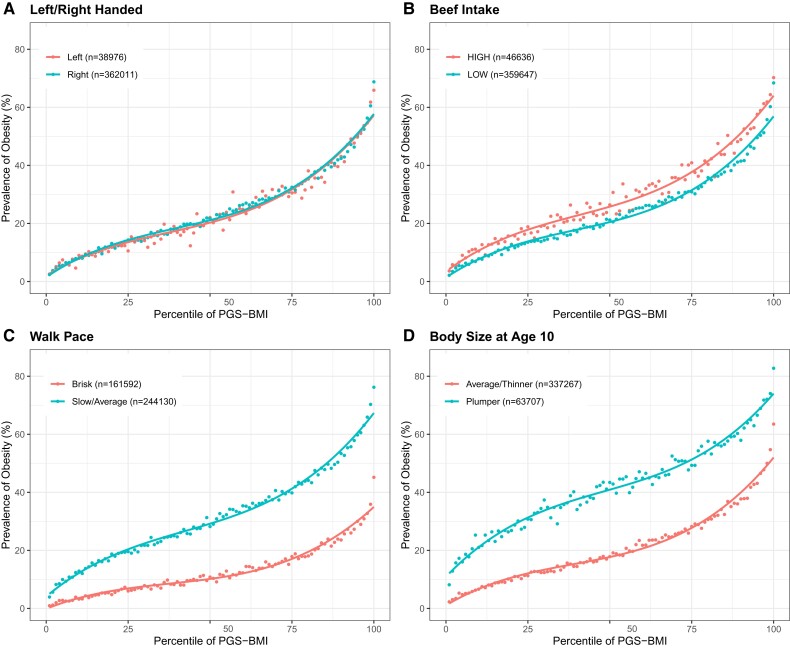
Fig. 1.
Four classes of prevalence versus polygenic risk relationships. Each panel shows two curves where the dots represent the observed prevalence of obesity for the percentile of PGS score for BMI in the high-risk or low-risk environment. (A) No effect (left vs. right-handed). (B) Constant shift (high vs. low beef intake). (C) Decanalization as defined in text (walk pace, slow/average vs. brisk). (D) Nonmonotonic change (body size at age 10, plumper vs. thinner).

