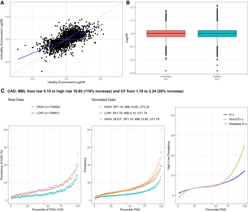
Fig. 4.
Calibration of the high-risk score. (A) Scatter plot contrasting estimated odds ratios for CAD for 2,499 significant SNPs (P < 0.001 in discovery data set) in the low (healthy) and high (unhealthy) exposures. (B) Boxplots showing the distribution of logOR effect size estimates in two environments. (C) The left-hand panel shows the prevalence–risk curve in the high- and low-risk exposures with indicated numbers of individuals. The middle panel shows simulated data with best fits of the MBL, CF, and SP as shown, including a curve (HIGH_NOCF) indicating the effect of not increasing the CF. The right panel shows the deviation between the high- and low-risk curves at each percentile of PGS, clearly indicating for CAD how failure to calibrate overestimates prevalence at high genetic risk. The curve for simulated data (H-L) after calibration closely overlay the curve for real data (Real data H-L) representing the observed difference, whereas the curve without calibration (H(noCF)-L) is over-dispersed. See Supplementary fig. S3, Supplementary Material online for other traits.

