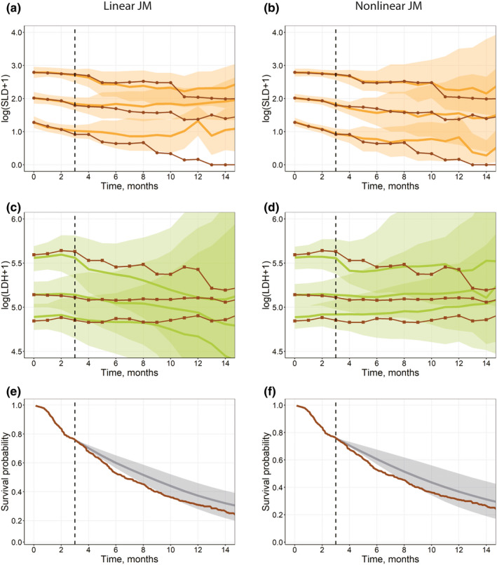
FIGURE 5.

(a–d) Visual predictive check plots for the interim validation data set (Validation step), based on univariate linear joint models in JM (a, c) and a multivariate nonlinear biexponential joint model in Monolix (b, d). Solid black lines represent aggregated log‐transformed biomarker data from the validation data set (circles, SLD; squares, LDH). Solid colored lines represent 10%, 50%, and 90% quantiles of averaged individual predictions (orange, SLD; green, LDH). Prediction intervals for each quantile are computed with a 95% confidence interval (shaded area). (e–f) Survival plot shows the experimental Kaplan‐Meier curve (solid brown) from the validation data set and the mean model prediction (solid gray) with the interquartile range (shaded area) for a multivariate linear joint model in JMbayes (e) and a multivariate nonlinear biexponential joint model in Monolix (f). LDH, lactate dehydrogenase; SLD, sum of the longest diameters of target lesions
