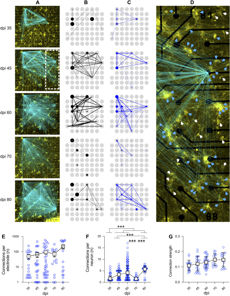
Figure 6. Functional connectivity maps over time based on spike-clustered data.
(A) Development of the number of validated connections between stimulated neurons and recording electrodes over 80 days post induction. Lines indicate a valid connection and are overlaid on the fluorescence image of the sample on the day of recording. Line intensity scales with connection strength. (B, C) Functional connectivity of the sample calculated for baseline activity and (C) holographic stimulation. Thickness and transparency scale with connection strength. Blue and black circles show general activity of the respective electrode, scaled to the maximum for each mode of experiment. (A, D) Shows a magnified view of the sample at 45 days post induction (marked as white rectangle in (A)). White arrows indicate neurons which were stimulated but did not show a significant response, whereas blue arrows indicate neurons for which stimulation elicited a significant response. (E) The average number of neurons connected to an active electrode, normalized to the overall number of stimulated neurons per experiment (N = 4 multi-electrode arrays [MEAs] and n = 56 electrodes with KS-validated connections). Connections per electrode represented in logarithmic scale (log 10) to visualize all data range. (F) Number of neurons showing a valid response to the stimulation of a target neuron on each MEA (N = 4 MEAs). (G) Strength of the connection of a neuron to the target neuron (N = 4 MEAs and n = 56 electrodes). Connection strength is measured as the maximum of the cross-correlation of the stimulus response of one neuron with the stimulus, represented by a train of boxcar functions. Data were compared between days using Kruskal–Wallis test followed by Dunn’s multiple comparisons test. *P < 0.05, **P < 0.01 and ***P < 0.001 versus specified date. Distance between electrodes, 200 μm.

