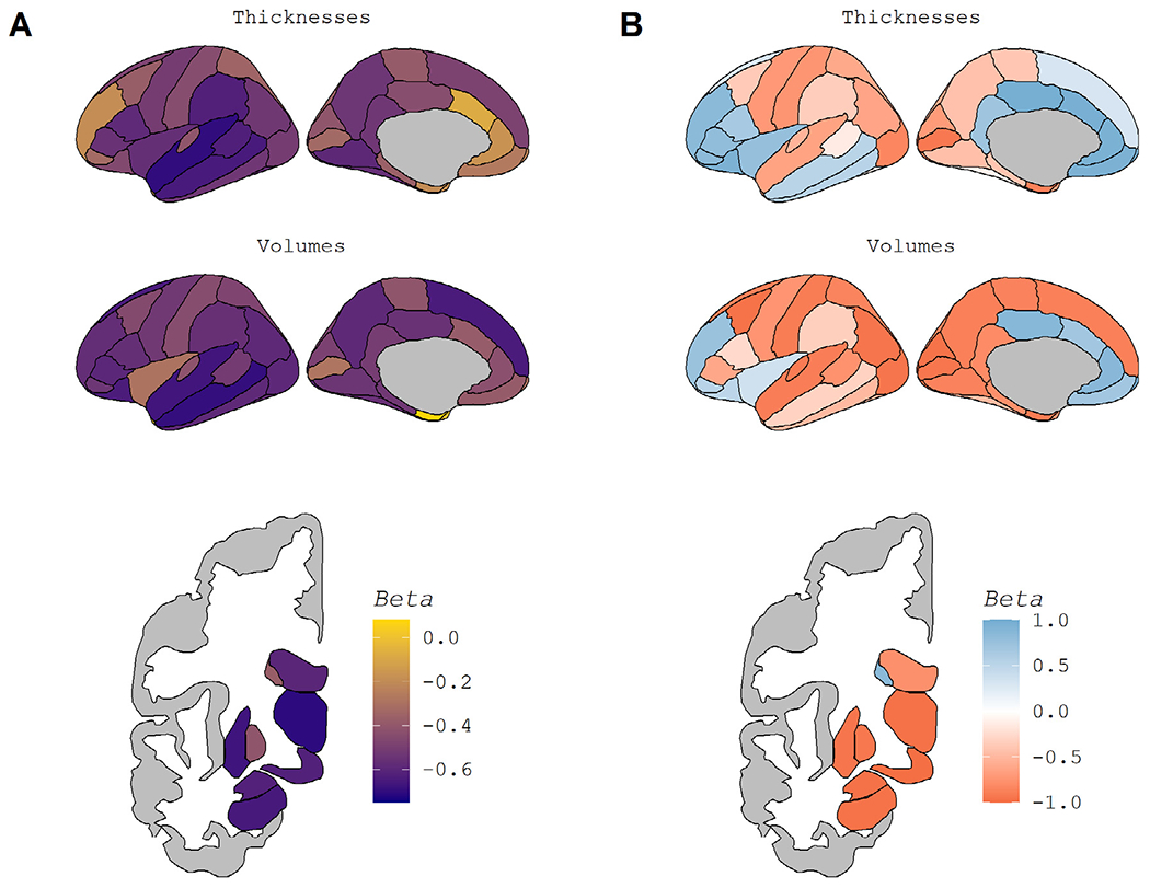
Fig. 2.

Regional Maps of Age-Related Atrophy. Fig. 2 displays regional maps of the standardized β weights from the linear models used to assess age-related atrophy. Fig. 2A displays the overall age-effect, taken from a direct comparison of participants’ ages and regional volume and/or thickness (blue line in Fig. 1A-D). A darker purple indicates more atrophy with age, while yellow indicates a lack of atrophy. Fig. 2B displays the pattern of atrophy with age, taken from the association of the age-derivative with age (blue line in Fig. 1E-F). Blue in Fig. 2B indicates regions whose rate of atrophy becomes less severe as age increases, while red indicates regions whose atrophy accelerates at later ages. To maintain the color schemes, the lateral ventricles are displayed with a reversed sign. (For interpretation of the references to color in this figure legend, the reader is referred to the Web version of this article.)
