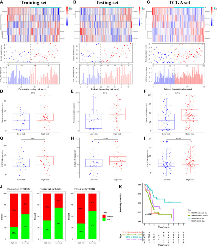
Figure 5.
The mutation correlation analysis using for signature verification. The risk curves of the training (A), testing (B) and TCGA (C) sets were composed of heat map, gene mutation point map, and UBQLN4 expression map. It reflected the changes in the number of gene mutations and the expression levels of UBQLN4 and GILncSig with the increase of risk value. Comparison of somatic mutation count between the high- and low-risk groups in the training (D), testing (E) and TCGA (F) sets. Comparison of UBQLN4 expression levels between the high- and low-risk groups in the training (G), testing (H) and TCGA (I) sets. (J) Comparison of the proportion of TP53 mutation status between the high- and low-risk groups in the training, testing and TCGA sets. (K) Combined survival analysis curve graph based on GILncSig clustering and TP53 mutation status.

