
Figure 4.
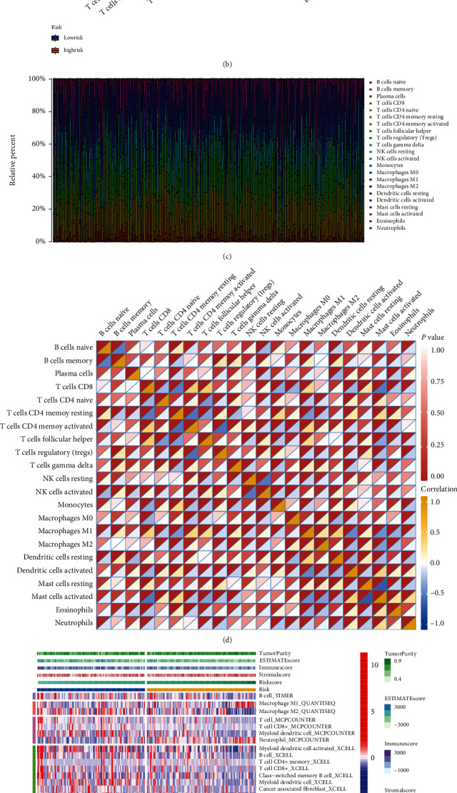
(a) Discrepantly distributed ICPs between clusters with different risk degree, ∗∗∗p < 0.001, ∗∗p < 0.01, ∗p < 0.05. (b) 22 TIC expressions were taken into a comparison between groups of different risk degree via Wilcoxon rank-sum, the outcome was shown in violin graph. (c) The bar plot presents the proportion of TICs of 22 kinds by showing multicolored stripes with different proportions of colored lengths. Sample IDs were set as stripes' names. (d) Heatmap shows the correlation (blue to yellow from low to high) and corresponding significance (presented by the depth of red color at the top left corner) between 22 types of TICs in each box. (e) Multialgorithm immune comprehensive analysis results, inclusive of existing data from platform TIMER, XCELL, MCP-counter, quanTIseq, and EPIC. The top bars show the TME-score distribution corresponding to risk score from low to high. (f) The calculation result of ssGSEA pictured by box plot, ∗∗p < 0.01, ∗p < 0.05.