
Figure 7.
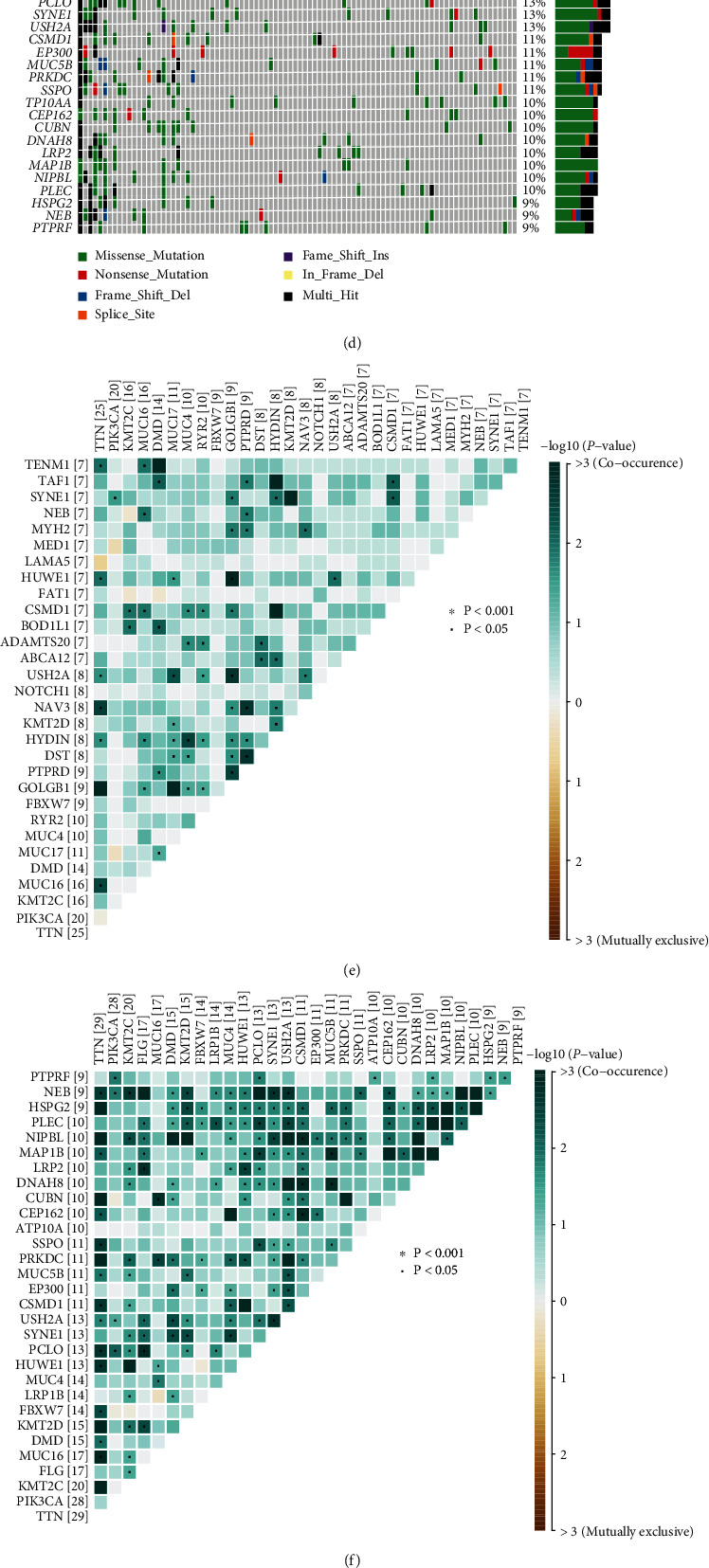
(a) and (b) The TMB distribution differentiates between the clusters with different PTGS2 expression levels, shown in box plot and correlation analysis. (c) and (d) Oncoplots show the mutation spectrums of the top 30 genes with the most quantity of mutation, respectively, in high- (c) and low-PTGS2 (d) groups. The central panels noted the mutated type for each sample. The colored top bar cluster tells the mutation frequency of each sample by providing colored stripes with different lengths. The bottom symptom is noting for mutation types. (e) and (f) The heatmaps demonstrate mutations with the mutual coexistence and exclusion of the top 20 most mutated genes of high- (e) and low-PTGS2 (f) clusters. The color depth of each cell implies the significance of the cooccurring relation. (g) and (h) The forest plot and cooncoplot display the most significantly discrepantly mutated genes. ∗∗p < 0.01, ∗p < 0.05, TENM2 and NUP155 rank first in parallel.