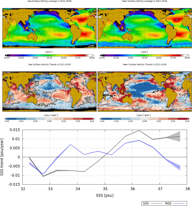
Figure 2.
Top row: salinity average in 2011–2018 as observed by the satellite (SSS) (left) and by the model (NSS) (right). Middle row: satellite SSS trends (left) and model NSS trends (right) in 2011–2018. Locations with trends being different from zero with a level of confidence are represented in black. Bottom plot: mean SSS (black) and NSS (blue) trend as a function of averaged SSS and NSS (respectively) in the same period. The shadowed area represents the confidence interval of the . Maps are plotted with Panoply v 4.12.0 (https://www.giss.nasa.gov/tools/panoply/).

